DSAR-Form Configuration
DSAR - Form Configuration
The privacy portal is where a user can place the Data Subject Access Requests. A user can make different types of requests based on the request forms configured. The Form tab under the Privacy Portal Configuration screen of the DSAR Configuration lets you create different forms for each request type and for each requestor separately.
To create a Form,
- Log in to the Data Governance Tool.
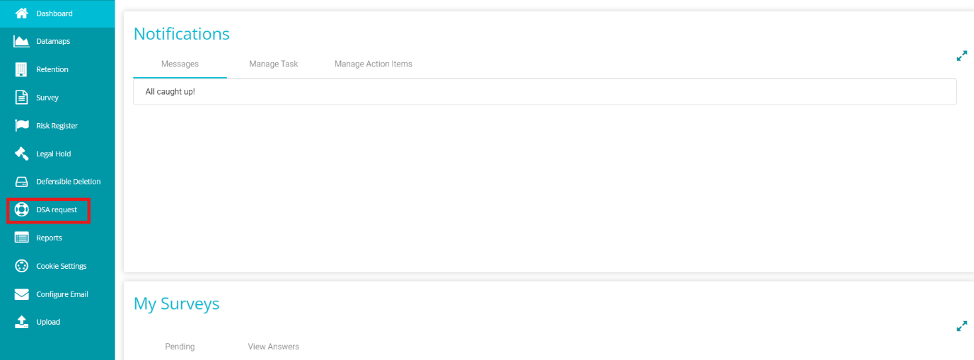
Once logged in, the Data Governance Tool displays the Main Screen.
- Navigate to the DSA Request module on the hamburger menu.
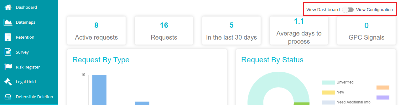
- Toggle the 'View Dashboard' button to 'View Configuration' to see the DSAR configurations.
- Go to the 'Form' tab.
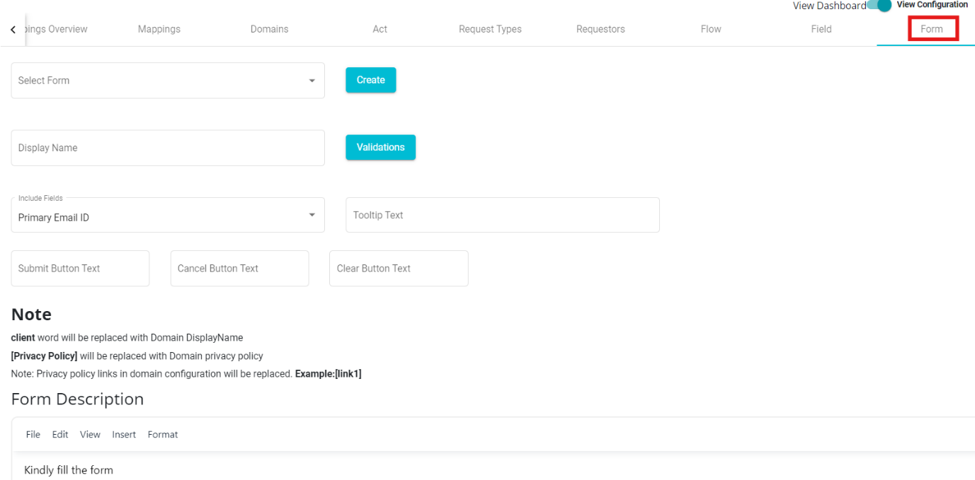
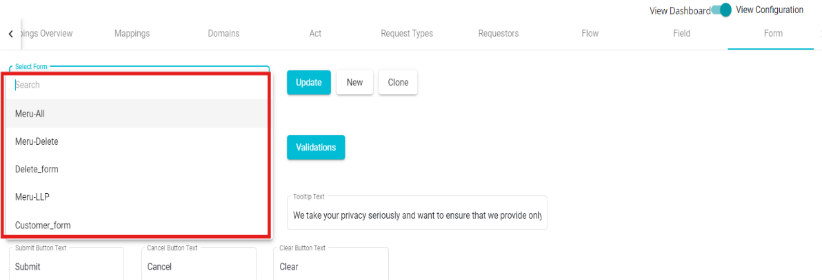
In case you want to choose from the existing form,
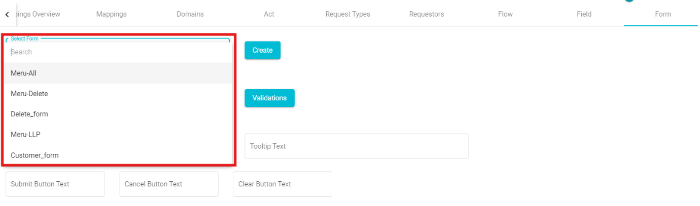
• Click on the 'Select Form' dialog box.
• Select any of the forms from the drop-down menu.
• Click on  to make the changes.
Similarly, to define a new form,
• Click on New option present next to the Update button, to create a new form. • Enter the 'Display Name' on the screen.
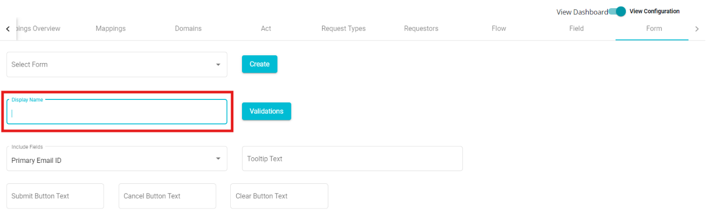
• Click on the 'Include Fields' drop-down menu.
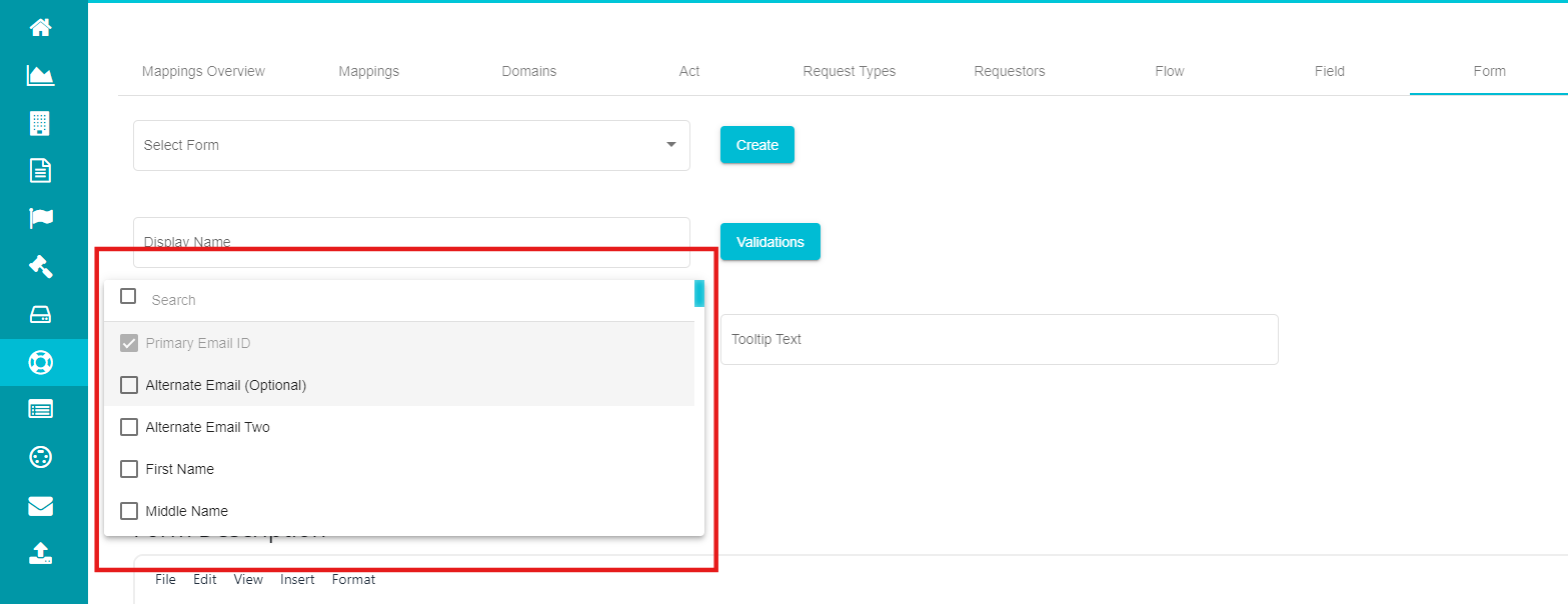
Note: The Primary Email ID field will be added to the new form by default and will be marked as a required field.
Here, you can see different fields that can be included within the form. You can select any of these options from the menu.
- Check the required fields from the drop-down menu.
A new form has been created for the domain. You can see the form preview on the screen. After configuring a form, you can include or exclude any field from it.
To include more fields,
• Click the 'Include Fields' drop-down menu.
• Mark the fields you want to include.
• Click 
To exclude existing fields,
• Click the 'Include Fields' drop-down menu.
• Uncheck the fields you want to remove from the form.
Note: If any field is under 'Rules,' it cannot be excluded until the rules are removed for that field.
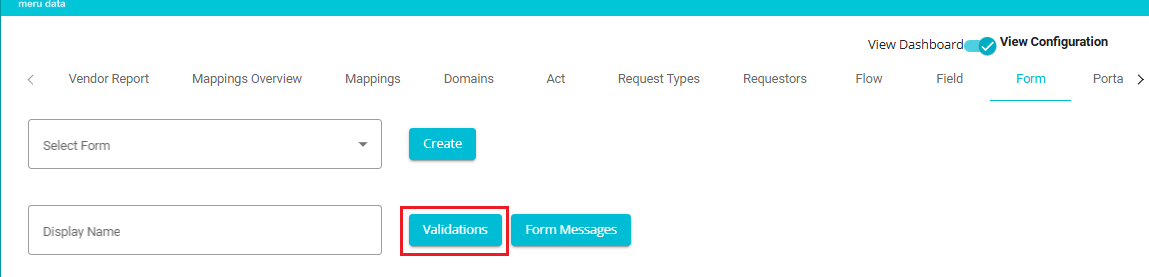
- Click on the Validations Button to add form configuration rules.
Form Configuration Rules:
The rules under the Validation Screen can include Dependency Rules, Grouping Rules, or a combination of both. These rules are designed to ensure data accuracy, logical consistency, and a smooth user experience during form submission.
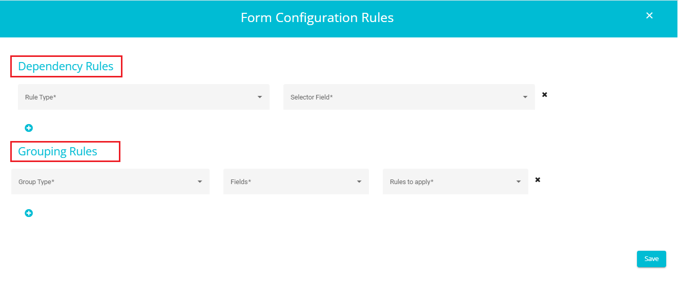
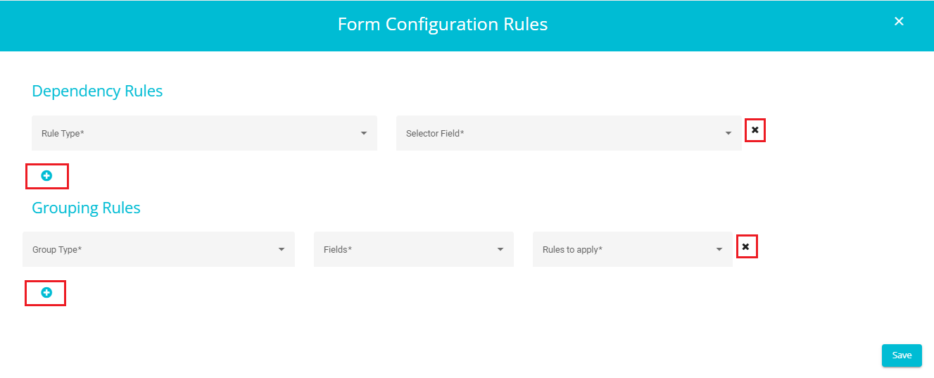
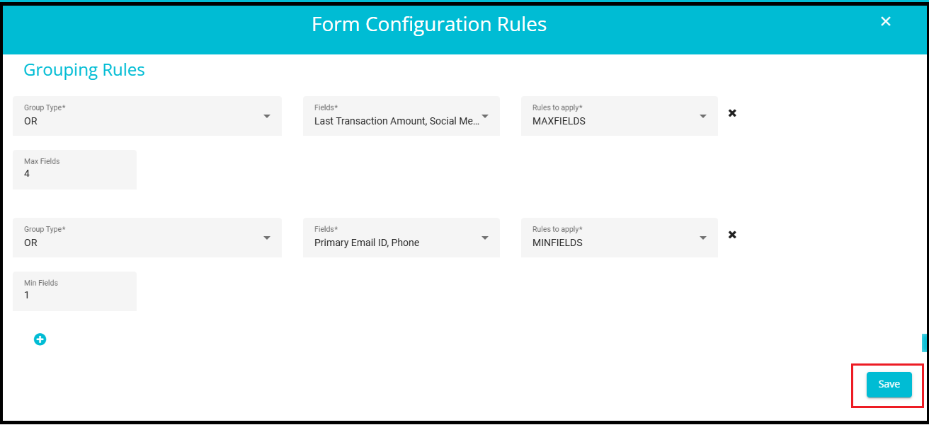
- You can add multiple Dependency Rules and Grouping Rules by clicking the "+" symbol. If you wish to remove any rule, simply click the "×" symbol next to it.
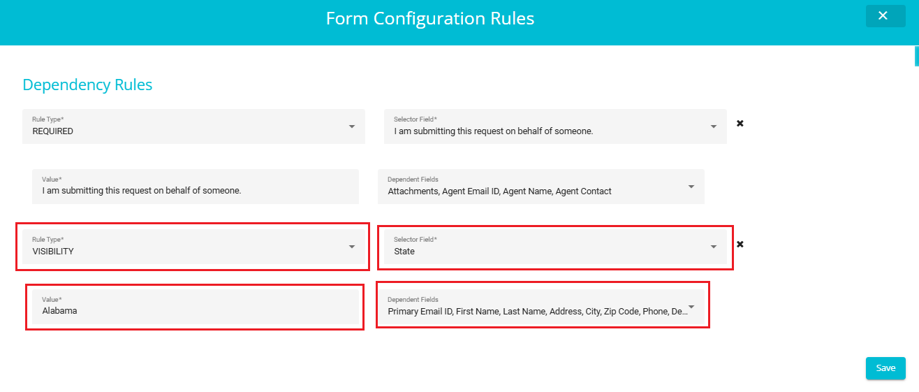
Dependency Rules
The Dependency Rules under the Validation Screen can include either a Required Rule, a Visibility Rule, or a combination of both.
These rules ensure that certain fields or values are only valid when specific conditions are met.
A field may be required, optional, or hidden based on the value of another field.
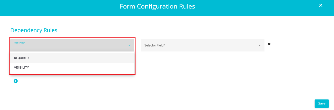
1. Required Rule Example:
If the field "I am submitting this request on behalf of someone" is filled, then the following dependent fields become mandatory:
Attachments
Agent Email ID
Agent Name
Agent Contact
This ensures that all necessary information related to the agent is captured when the request is submitted on behalf of another person.
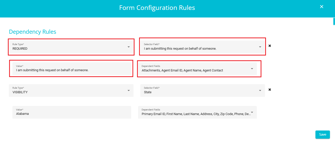
2. Visibility Rule Example:
- If the State field is set to "Alabama", then the following fields will become visible:
Primary Email ID, First Name, Last Name, Address, City, Zip Code, Phone, Description, etc.
This rule ensures that only relevant fields are displayed based on the selected state, improving user experience and reducing clutter.
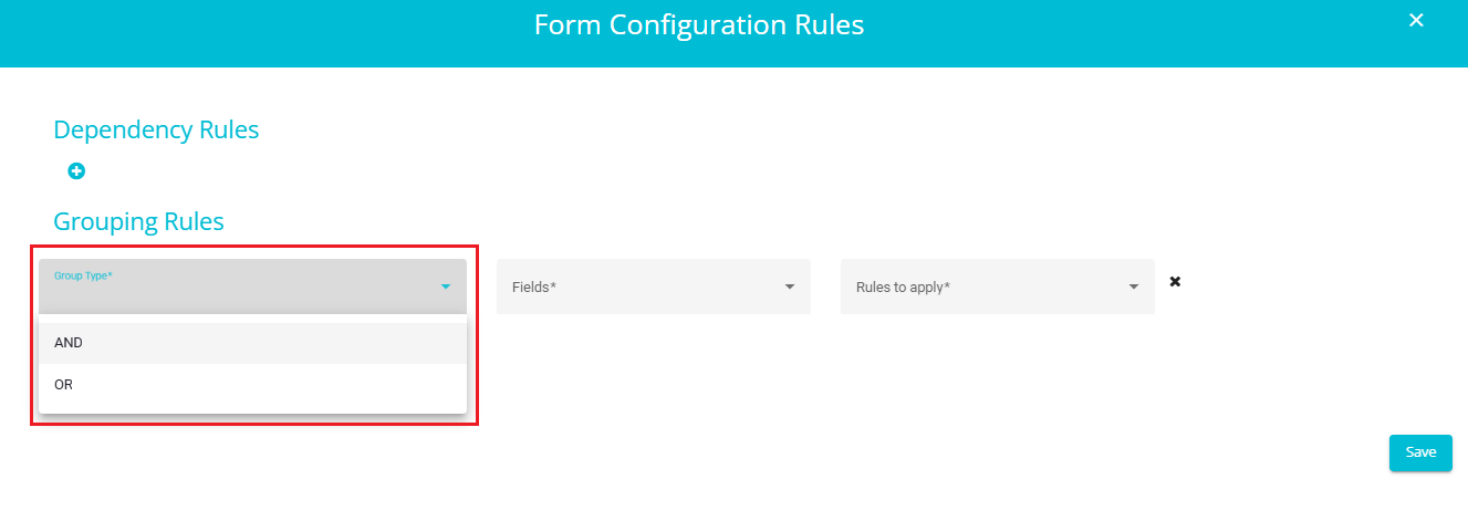
2. Grouping Rules
These rules apply to sets of fields that are logically related and should be validated together.
Fields within a group may have collective constraints, such as requiring at least one field to be filled or ensuring mutual exclusivity.
Types of Grouping
OR Grouping
a. At least one of the grouped fields must meet the specified condition.
b. Useful when any one field from the group is sufficient for validation.
AND Grouping
a. All grouped fields must meet the specified condition.
b. Ensures that every field in the group is validated together.
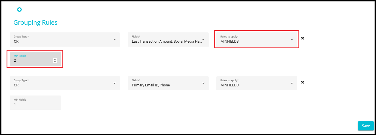
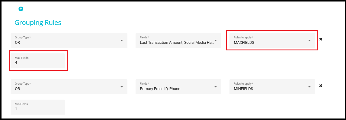
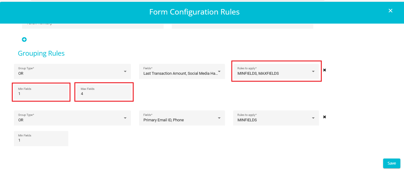
Rules to Apply
You can apply one or more of the following rules to a group: Required, MinFields and MaxFields.
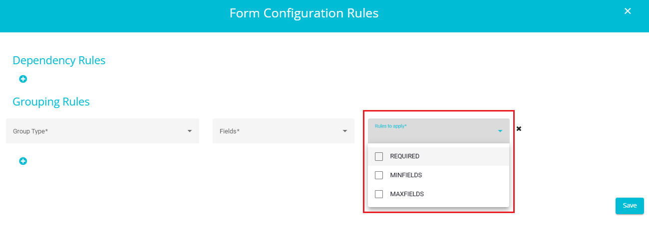
Required
All fields in the group must be filled.
Example: If 3 fields are grouped using OR and Required is selected, then all 3 fields must be filled.
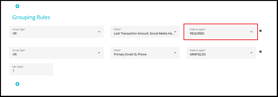
MinFields
Specifies the minimum number of fields that must be filled within the group.
Example: If MinFields is set to 2, at least 2 fields in the group must be filled.
MaxFields
Specifies the maximum number of fields that can be filled within the group.
Example: If MaxFields is set to 4, no more than 4 fields in the group should be filled.
- You can also apply both MinFields and MaxFields simultaneously to define a valid range of filled fields.
- After adding all necessary validation rules, click on the "Save" button to apply the configuration.
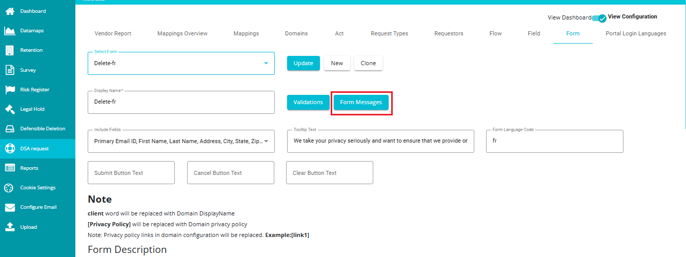
Form Messages:
The Form Messages feature plays a crucial role in enhancing user experience by allowing error and validation messages to be displayed in the user's preferred language. This is especially useful in multilingual applications where users may not be fluent in the default language of the interface. By configuring messages in different languages, users can better understand what went wrong and how to correct their input, reducing confusion and improving form completion rates.
Steps to Configure Error Messages in a Specific Language (e.g.,French)
- Click on the "Form Messages" Button.
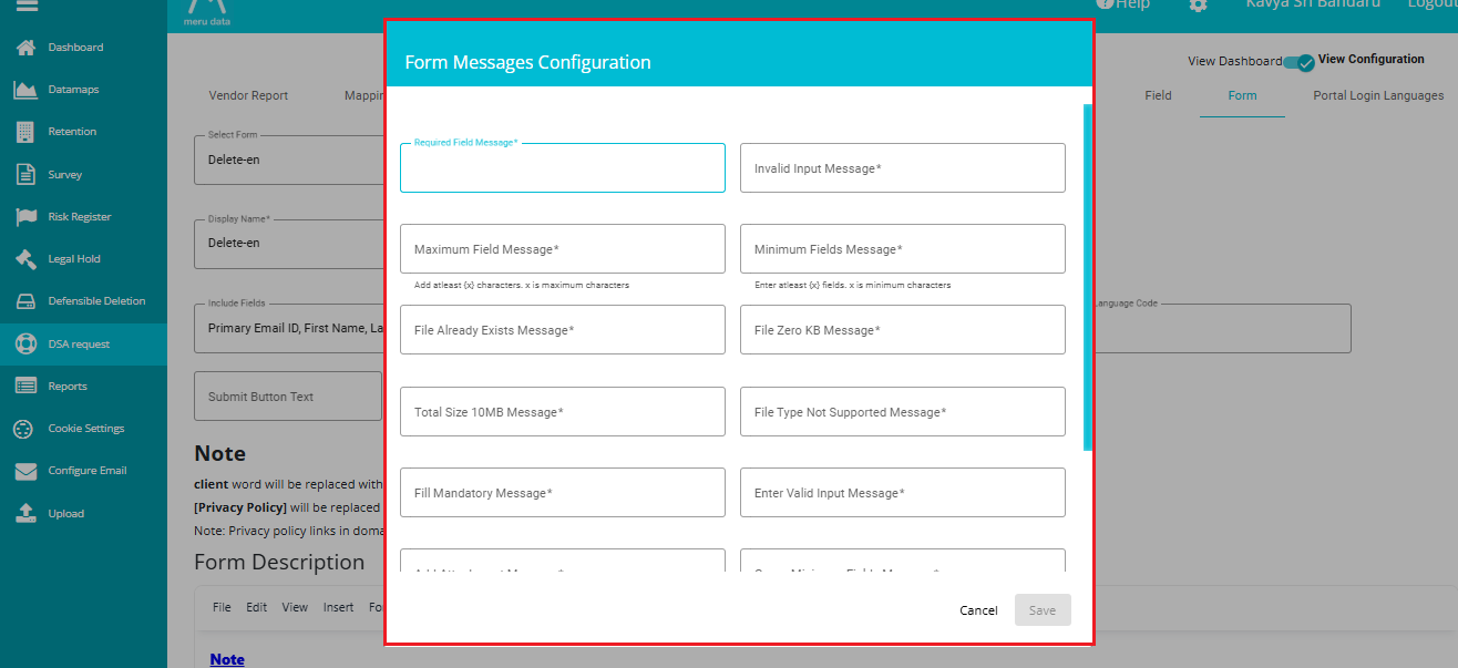
- After Clicking "Form Messages", You Will See a Form
This form contains fields for various error messages like "Required Field", "Invalid Input", "File already exists", etc.
- Translate the Error Messages
Use a translator or manually enter translations for each field's error message.
Example:
English: "This field is required."
French : "Ce champ est requis."
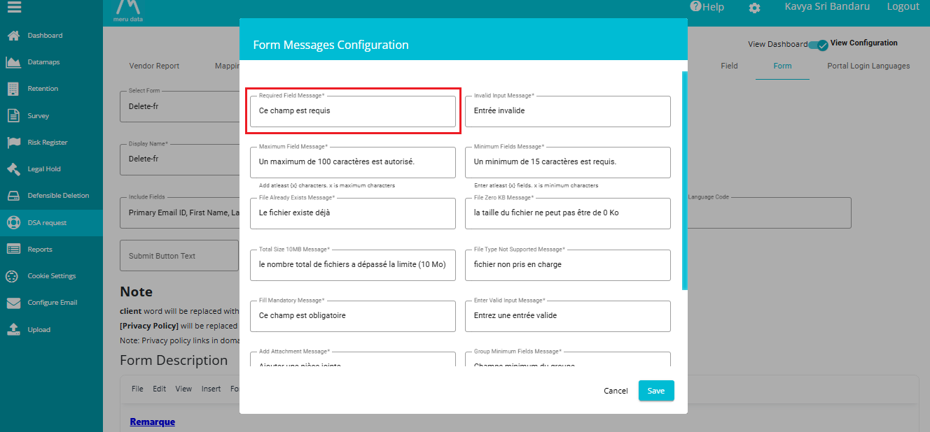
- Click "Save"
Save the translated messages for that language.
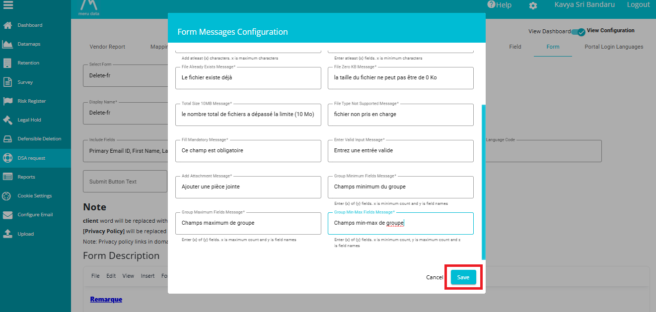
- Open the Form
When a user selects or is detected to use French, the form will now display validation or Error messages in French.
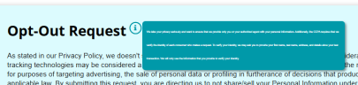
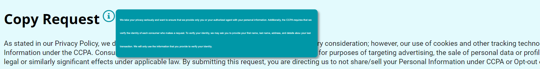
Tooltip Text:
Another option on the Form Tab is the ToolTip Text present next to the 'Include Fields' option. When this option is defined, an 'i' button can be seen next to the title of the Request Form. Placing the cursor on this icon displays the message typed in the Tooltip Text box. To define it,
• Click on the 'Tooltip Text' box. • Type the message to be displayed.
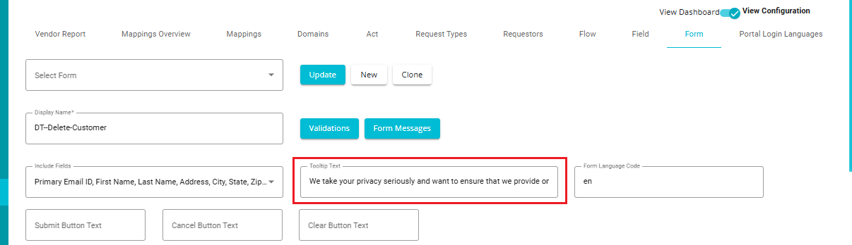
The same message gets reflected on the request form and can be seen by the user whenever they open the request form to place a service request.
Users have the ability to add Hyperlink/Link in tooltip. So that user can click on the link to access the Page or Download any Form, etc. User can have the link as Text as well as tooltip.
If you delete the Tooltip Text and Update the changes, the tooltip button automatically disappears from the form.
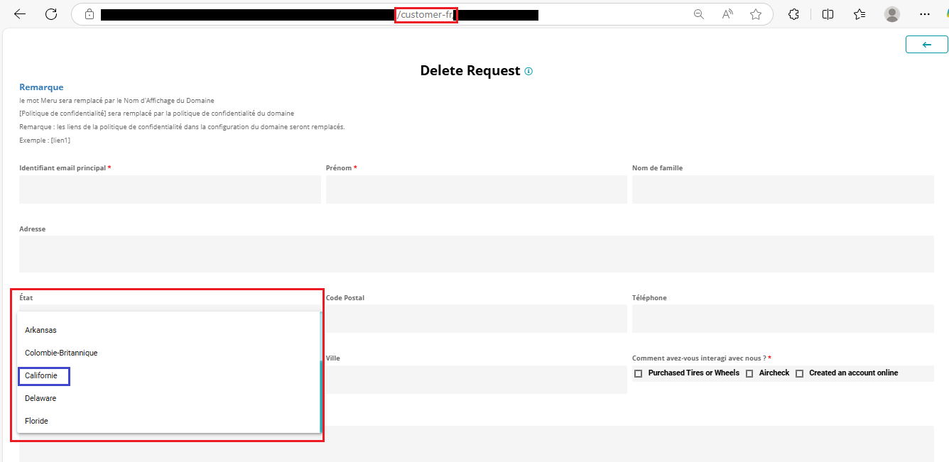
Form Language Code
The Form Language Code field enables the form to display translated values for specific fields, especially those with predefined choices.
Note: This feature is not applicable to the entire form content. It specifically applies to fields with selectable choices, such as: Dropdowns, Checkboxes, and Radio buttons, etc.
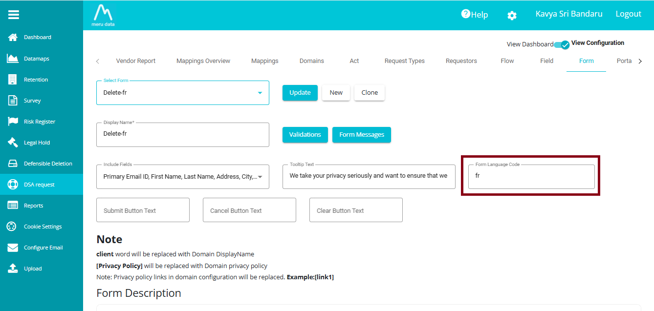
Example:
If the state field is configured with the following JSON:

Then:
If the Form Language Code is set to fr, the state will be displayed as "Californie".
If set to es (Spanish), it will show "Californio".
If set to Ru (Russian), it will show "Калифорния".
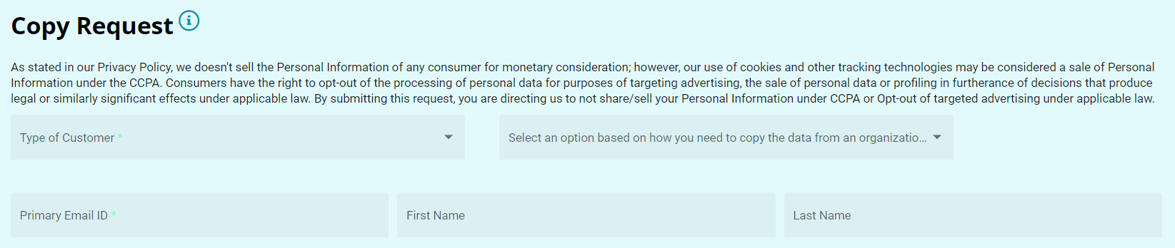
Form Description:
This option can be used to provide a description below the title of the Request Form. To do so,
Click on the 'Form Description' box.
Type the message to be displayed.
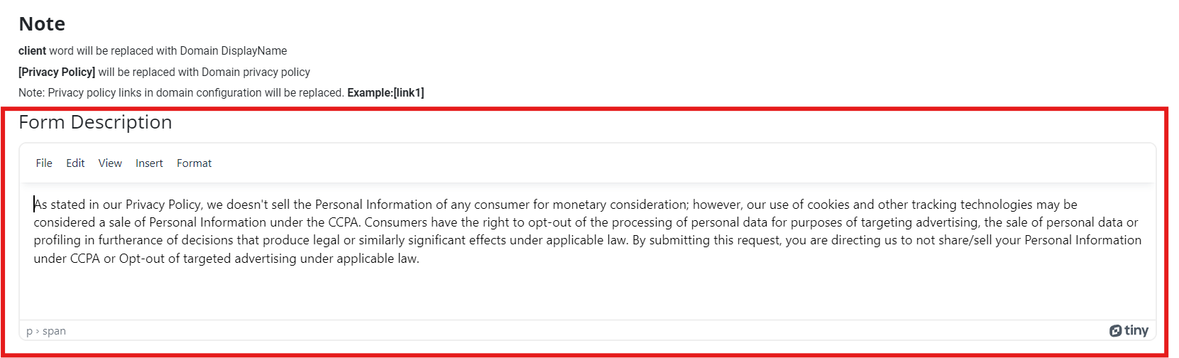
This tab also provides the following options for formatting the form's description.
File -- a drop-down menu with a new document option to erase the existing description and start a new description.
Edit -- a drop-down menu with Cut, Copy, Paste, and different options to format the text.
View -- can be used to view visual aids linked to the form.
Insert -- can be used to hyperlink to any URL or links to the description.
Format -- a drop-down menu with Bold, Italic, Underline, and various other options to format the description.
The description can be seen below the title of the request form once the changes are updated. Delete the text in this box and update the changes to remove the message.
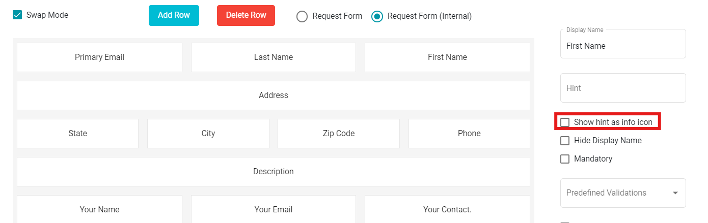
Swap Mode:
The Form tab provides another option 'Swap Mode.' Using this, you can swap different fields in a row or between different rows.
To enable Swap Mode,
• Check the 'Swap Mode' button.
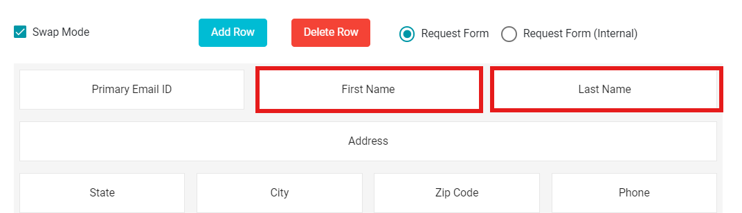
You can now swap the fields in a row on the defined form. Just drag and drop the desired fields within a row or between different rows to swap their positions.
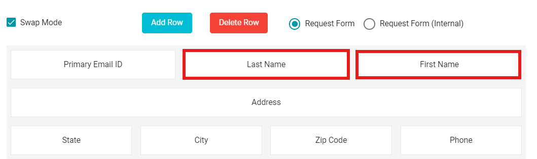
Note: Unchecking the Swap Mode disables the swapping option between two fields. In this case, the dragged field is embedded into the row alongside the other fields, instead of swapping.
Add and Delete Rows: You can add numerous fields to your form. However, if the form is full and you need more space to create new fields, you can use the Add Row option.
• Click on  button present next to the Swap Mode button.
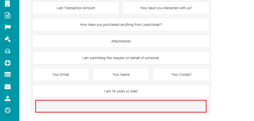
This selection provides you with an empty space on the form to create more fields.
Likewise, if you want to delete a row, you can use the Delete Row option.
• Click on  button present next to the Add Row
button.
button present next to the Add Row
button.
This selection deletes the empty space from the form.
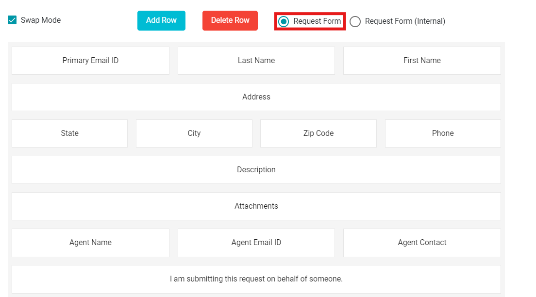
Request Form and Request Form (Internal):
The Form tab provides two options -- Request Form and Request Form (Internal) when configuring it. These options are present next to the Delete Row option, and you can select either of these for the changes to be visible.
Request Form -- if you select the 'Request Form' option, whatever changes made to the form will reflect on the Request Form from the Welcome Screen directly.
Request Form (Internal) -- when choosing this option, the changes are reflected in the internal form of the Request Form.
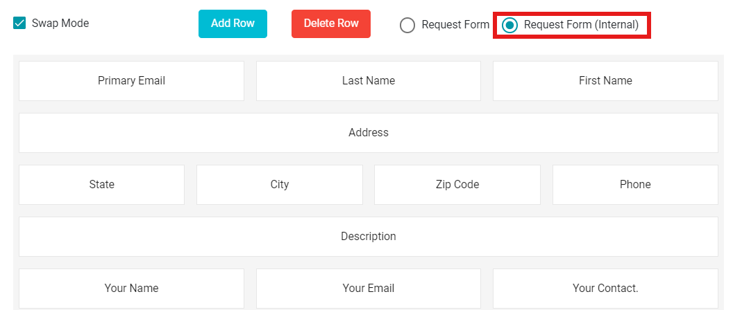
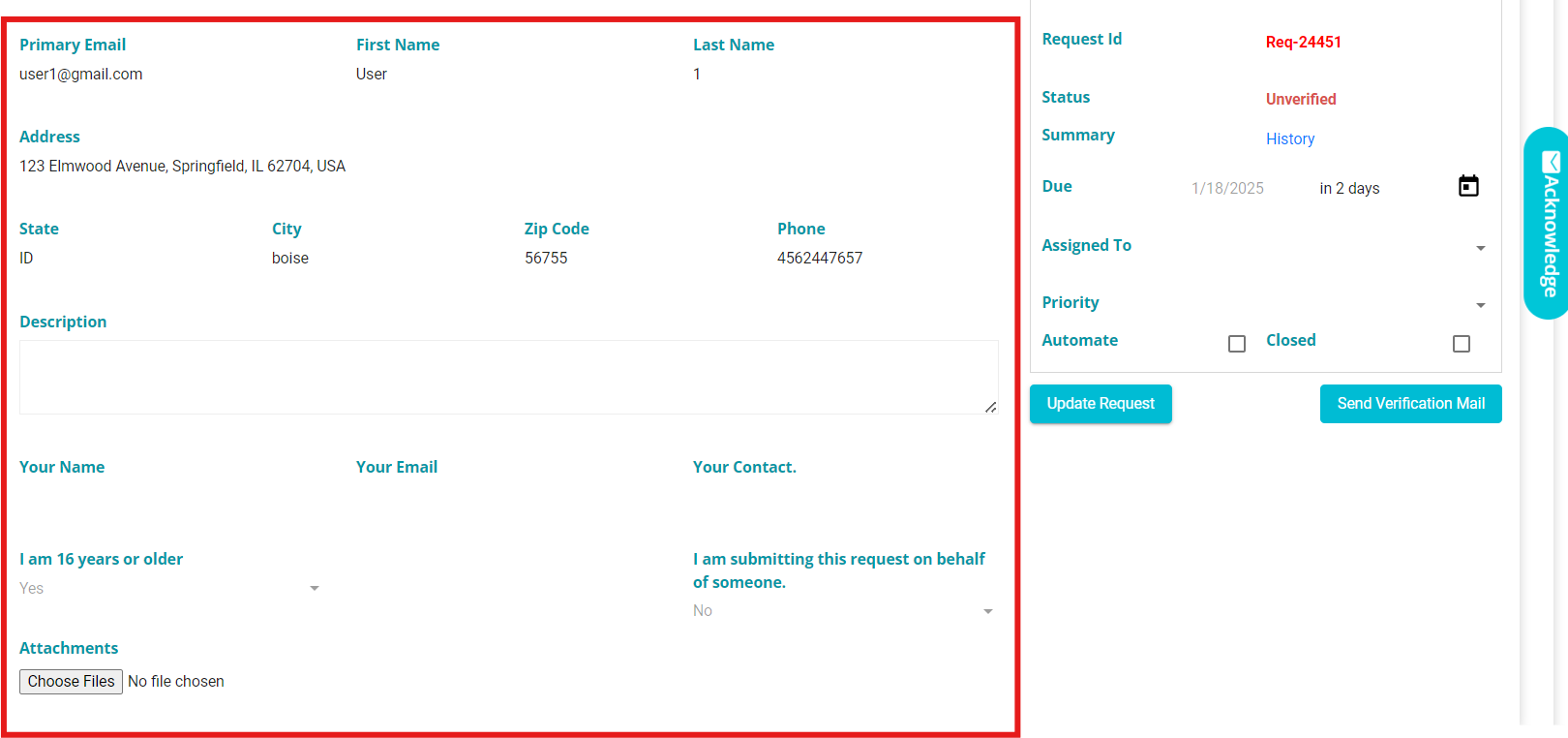
Internal configuration determines how DSR requests appear in our UI. The configuration is visible on the Request tab screen.
Selecting on any of the fields displayed on the screen shows the following options to further customize the request form.
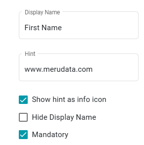
- Display Name -- shows the display name of the selected field.
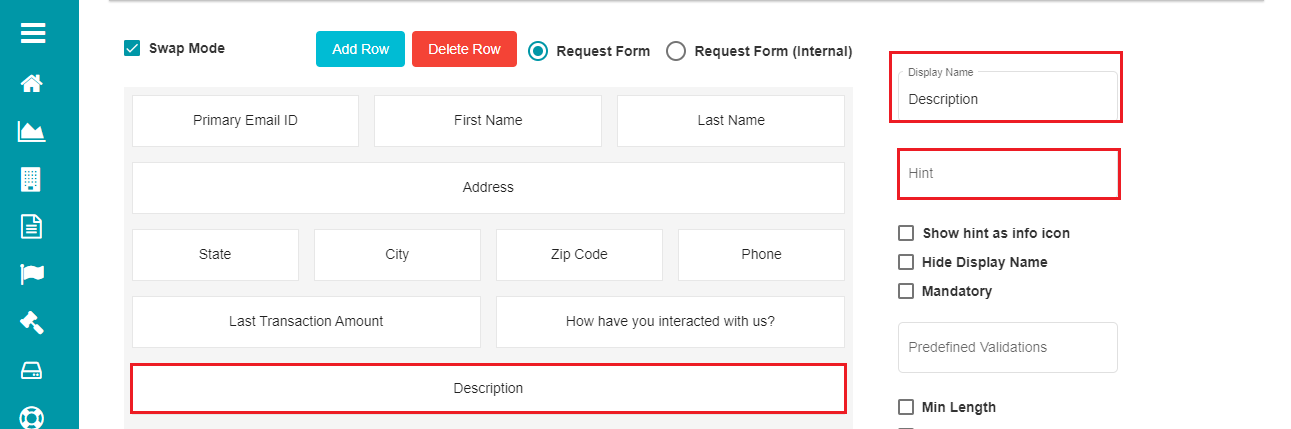
- Hint -- this option can be used to add any hint to the selected field to help the user understand more about it or what they can enter as inputs.
Users have the ability to add Hyperlink/Link in hint. So that user can click on the link to access the Page or Download any Form, etc. User can have the link as Text as well as hint. This can be applied for all field types such as Single Line, Multi Line, Checkbox, text area, Radio group, Dropdown, attachment, etc.

Whenever a hint is defined for a field in the request form, the user can see the hint message below the field. This applies to any field, not just mandatory ones, as specified by the user.
- Info Icon:
Check the 'Show hint as info icon' button.
Click
The form now shows the info icon against every field with a hint message.
- Hiding the Display Name:
In case you want to hide the display name for the selected field in a form,
- Check the 'Hide Display Name' option.
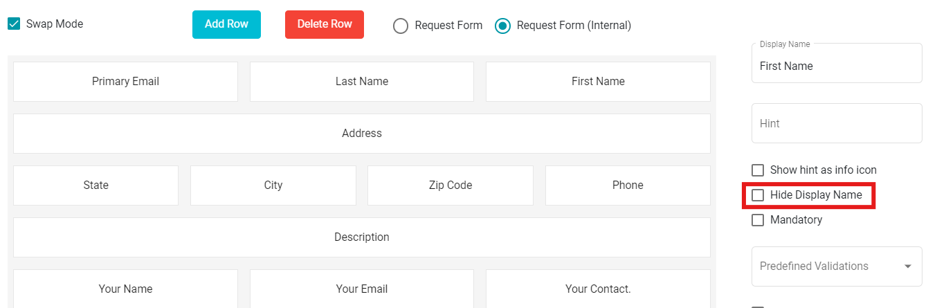
Note: Uncheck the 'Hide Display Name' option if you don't want to hide the display name for the selected field within the form.
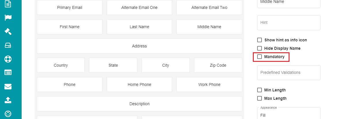
- Mandatory Fields:
When selecting this option, the user cannot submit the request form until all the mandatory fields have appropriate response.
Check the 'Mandatory' option to make a field mandatory.
Click
If you want to remove this selection for a particular field,
Uncheck the Mandatory option for that field.
Click
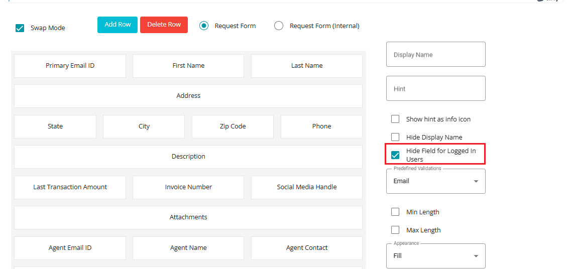
- Hide Field for Logged in Users:
This checkbox allows administrators to control the visibility of specific fields in both mobile and web applications. When enabled, the selected fields will be hidden from users who are logged in to Mobile app or Web. This feature is particularly useful for scenarios where certain data should only be visible to guest users or during onboarding processes, ensuring a cleaner and more relevant user interface for authenticated users.
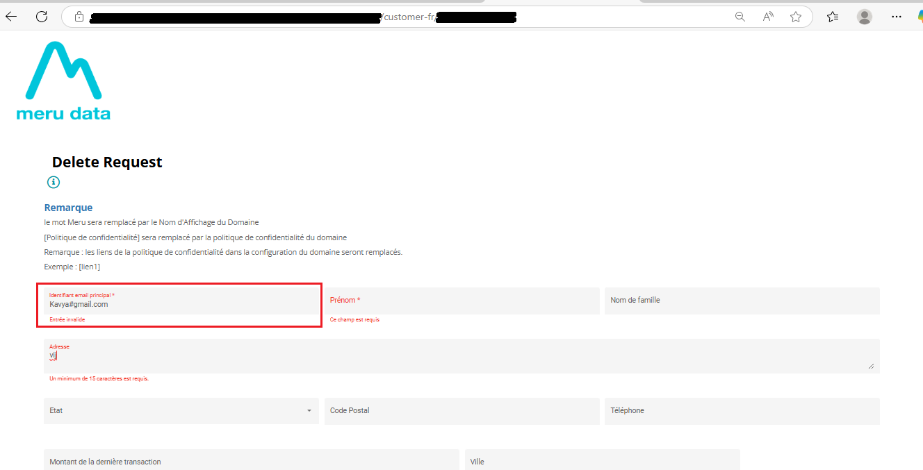
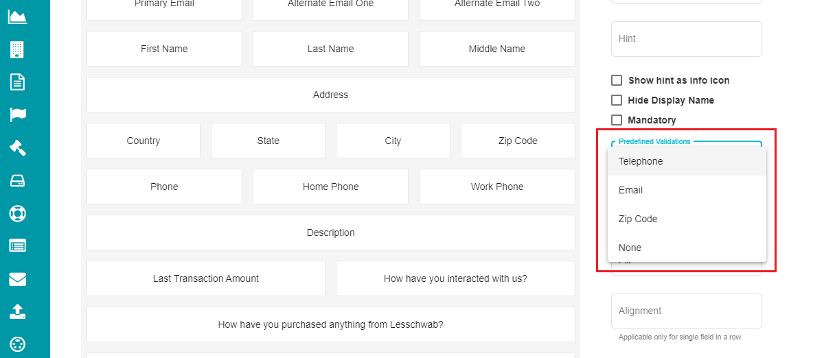
- Pre-defined Validations:
The users can sometimes enter invalid inputs to the request form, making it difficult to process them. In that case, some validations can be added to required fields to avoid this discrepancy. Right now, there are four pre-defined validations for the fields - Telephone, Email, Zip Code, and none.
- Telephone - the user can only enter phone numbers on the field with this validation.
Eg: (555) 123-4567 or some other 10-digit phone number.
Email - this validation restricts the users to enter anything apart from the email IDs.
Zip Code - the user can only enter their Zip Code (5-7 digits) in the fields with this validation.
Eg: Beverly Hills, CA → 90210, Berlin → 10115, London → SW1A 1AA etc.
- None - This option provides no validation.
For pre-defining the validations,
- Click on any field on the form.
Open the 'Predefined Validations' drop-down menu.
Select the input to be validated for the specific field.
Note: If you do not want any validation for a field, you can select the 'None' option from the drop-down menu.
- Min Length & Max Length
These options can be used if the user's input should be limited to a specific number of characters for an input field.
Min Length - checking this option would mean that the user must enter a minimum of the characters entered in this field for the selected input field.
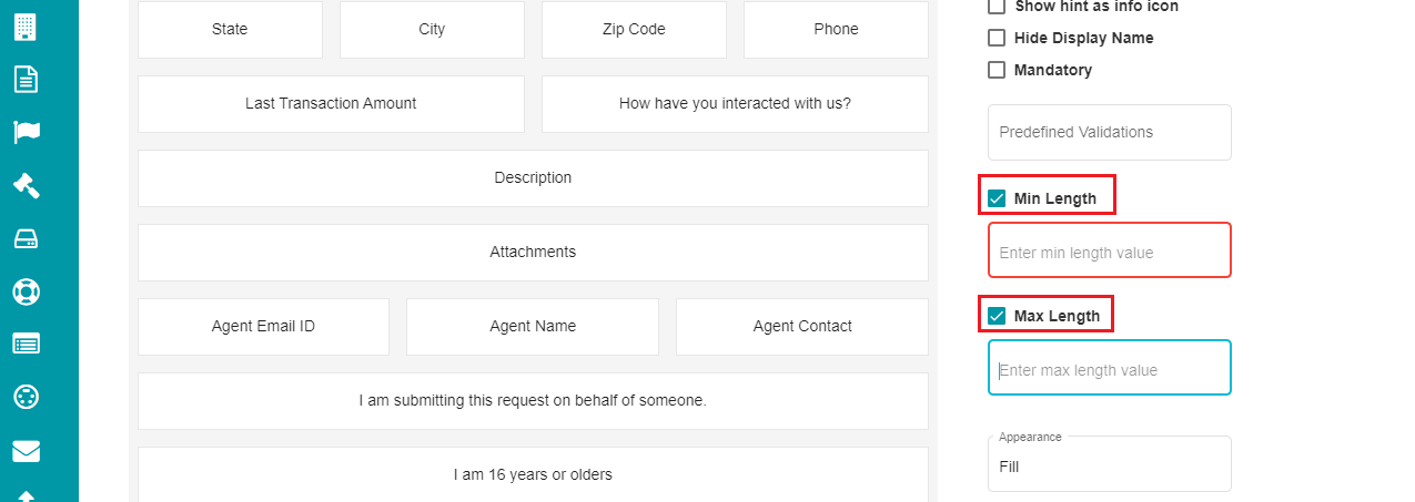
Max Length - this option lets the user enter a maximum of the characters defined for the selected field of a request form.
Note: Uncheck any of these options at requirement if you don't want to restrict the input characters.
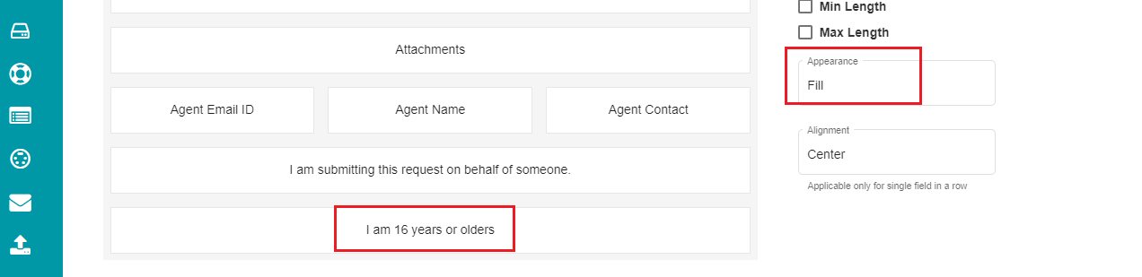
- Appearance
This drop-down menu provides two options - Fill and None. Selecting fill for any field would display a background to the field in the request form.
The same appears on the request form in the following way:

Note: Select None from the menu for the fields to be displayed without a background.
- Alignment
It is a drop-down menu for choosing the field's alignment in a request form. The menu provides three options - Left, Center, and Right.
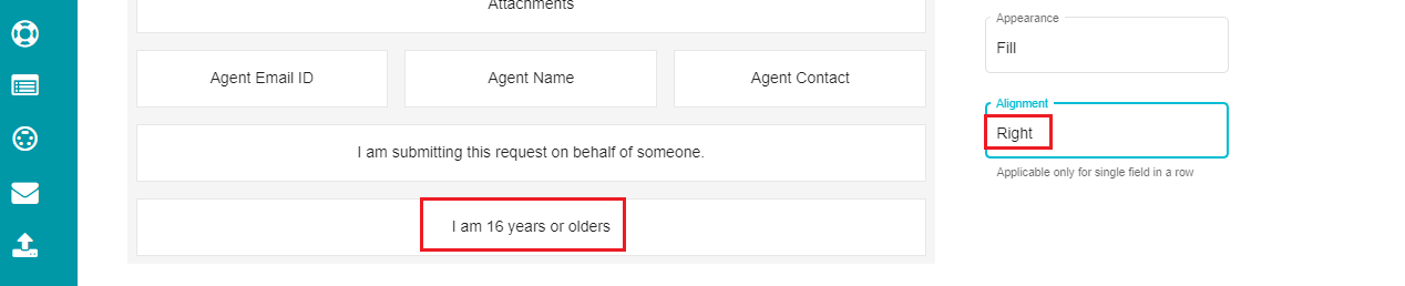
The same appears on the request form like so:

Note: Alignment option is applicable only when the entire row of the request form has a single field.
These options can be defined for every field on the request form at requirement. It is essential that you click on the button after making any changes for it to reflect on the request form.
Cloning a Form:
If you want a new form by slightly modifying an existing form, you can use the Clone option for it.
• Click the 'Select Form' drop-down menu. • Select the form to be cloned.
• Click on  You can enter the Display Name, make the necessary modifications, and click on to duplicate an existing form.
Mapping the Form:
A form, after configuration, must be mapped to a domain for it to be reflected on the privacy portal's welcome screen.
For mapping the form to a domain,
Go to the DSAR Configuration homepage.
Click the 'Mappings' Tab.
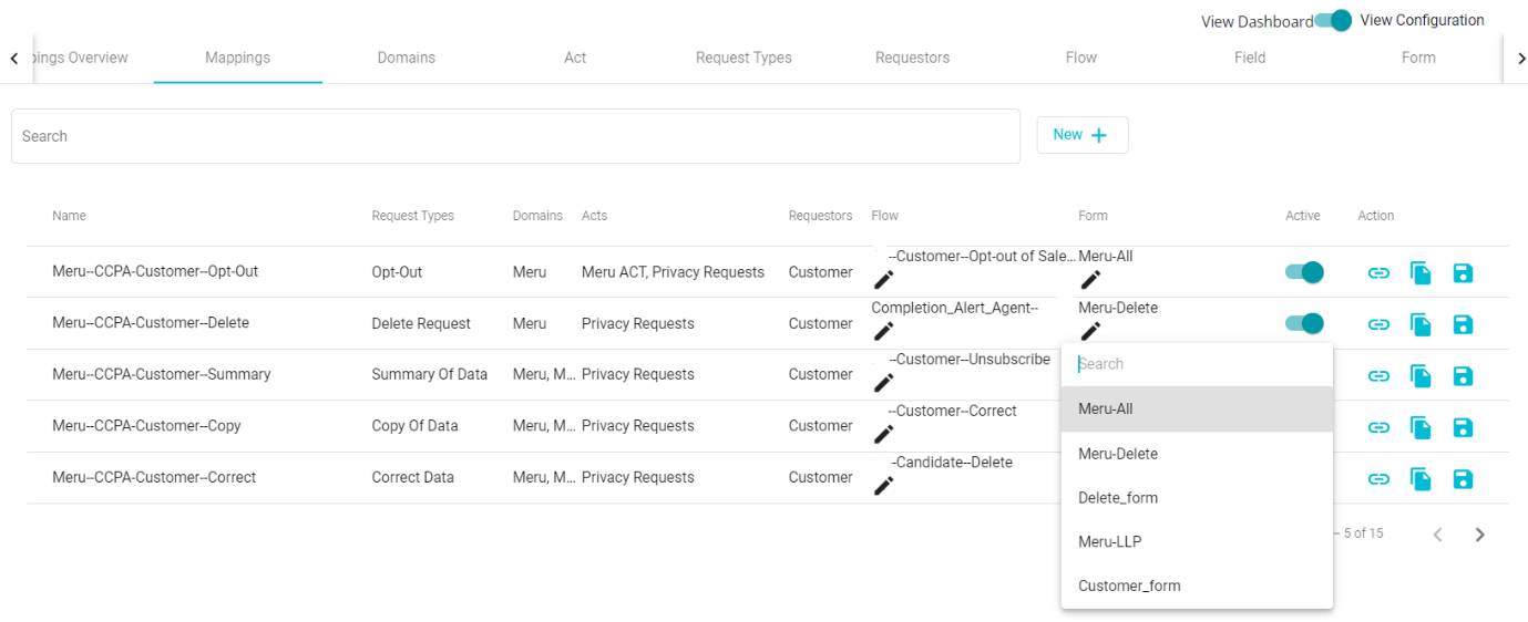
- Click the drop-down menu under the 'Form' tab.
You can find the new and cloned forms in the drop-down menu along with the pre-defined ones.
Select the required form from the menu.
Check the 'Active'
 icon after making the selection.
Tap the 'Update' icon.